
Brand Identity guidelines
Introduction
At Insight Health, our brand is more than a logo, a typeface, or a color palette— it’s a story, an experience, and a promise. This Brand Guideline Manual is your comprehensive resource for understanding and applying our brand consistently and effectively across all touchpoints.
Our identity has been thoughtfully crafted to reflect our values, vision, and the unique role we play in the lives of our customers. Through these guidelines, you’ll find the tools and inspiration needed to communicate our message with clarity and confidence.
About the brand
Bringing together deep Medical and Technological expertise
our aim&Vision
Insight Health leverages cutting-edge AI tools to streamline clinical documentation, reduce burdens, and enhance patient care, empowering clinicians to focus on delivering secure, personalized healthcare
logo design
Logo
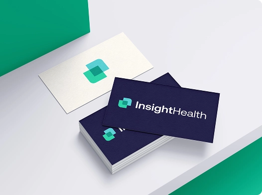
The Insight Health logo embodies a modern and versatile design, reflecting the brand's innovative spirit and commitment to excellence.
The two rounded squares intersect, symbolizing the seamless integration of medical expertise and cutting-edge AI technology—Insight Health's core value. This intersection not only highlights collaboration but also conveys a sense of harmony and precision.
Logotype
The logotype represents the brand’s identity using only typography, showcasing a clean and modern design that reflects Insight Health’s professional and innovative nature. Without the logo mark, the logotype stands strong on its own, emphasizing clarity and legibility in some applications such as B/W occasion.


Logomark
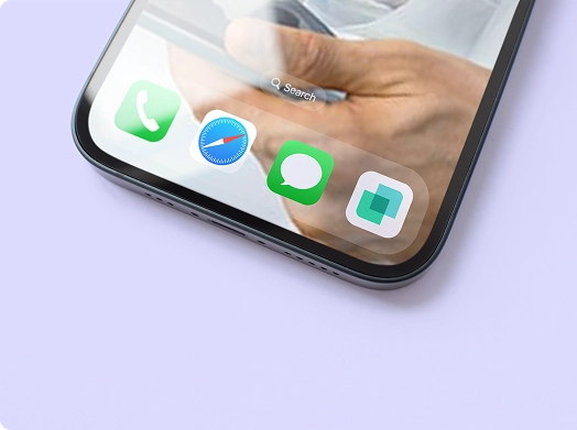
The logo mark is designed with versatility in mind, making it ideal for various digital and physical applications. Its clean and recognizable form ensures it performs seamlessly as an app icon, favicon, and profile image on social media platforms. Whether scaled down for compact digital spaces or used prominently in larger formats, the logo retains its clarity and impact.
usage examples
Clear space
For optimal use and to ensure brand integrity, the InsightHealth logo should never be placed too close to other visual elements. As a best practice, the size of the intersection element within the logo can be used as a safe zone reference which no other element (such as text, images, etc) should cross.

Logo don’ts
This guidelines are supposed to help avoiding common mistakes, ensuring that the logo is always correctly positioned, sized and colored to maintain the brand's identity and integrity


colors
Mint Green
HEX: #30D8A7
R: 48
G: 216
B: 167
Cold Blue
HEX: #5ED4D6
R: 94
G: 212
B: 214
Lavender
HEX: #A8A8F9
R: 168
G: 168
B: 249
Marine
HEX: #139E85
R: 19
G: 158
B: 133
Shell White
HEX: #FFFCF4
R: 255
G: 252
B: 244
Navy Black
HEX: #231D40
R: 35
G: 29
B: 64
Light Gray
HEX: #F1EFF5
R: 241
G: 239
B: 245
combinations
The consistent use of color is vital to effective brand recognition. Our brand should always be represented in color combination system explained on this page.
In most cases the text should be displayed in
Off White on 100% color backgrounds or Ash Black on background with colors in opacity.
Don't use color-on-color combination.
typography
TYPEFACE
Aeonik font has modernist roots but with its details it positions itself as a Neo-Grotesk with a geometric features. Structurally, this creates a fantastic balance for both display and text use. It lends a contemporary edge to the brand's visual communication, ensuring consistency and legibility across various platforms and materials.
weights
ABCDEFGHIJKLMNOPQRSTUVWXYZ
abcdefghijklmnopqrstuvwxyz
0123456789° (!"#$%&?@)
ABCDEFGHIJKLMNOPQRSTUVWXYZ
abcdefghijklmnopqrstuvwxyz
0123456789° (!"#$%&?@)